Strengths:
- Good use of camera shots
- Good effects
- Some shots seemed too long
- Good music
- Good use of mise en scene
- Enigma is created through restricted shots
Weaknesses and improvements:
- Unsteady Camera
- Music Changed too quickly
Strengths:
- Good use of sound effect and speed up motion of the tube
- Very good use of mise en scene i.e: Costume.
- Like static in middle, used a little more often?
Weaknesses and improvements:
- Walking shots little too long- a bit shorter?
Strengths:
- Framing is good
- Good variety of shots
- Music is good at times
Weaknesses and Improvements:
- Poor quality in the tube station
- Car park scene is repetitive and too long
- Music at the end is bad
- Acting is bad
Strengths:
- Inventive cinematography
- Good editing- titles, speed
- good soundtrack
Weaknesses and improvements:
- Very shaky
- Too restricted when she changes
- Some editing wrong in places
Strength:
- Good Mise en scene
- Special effects
- Good editing-CCTV
- Framing shots is good
Weaknesses and improvements:
- Music didn't fit the film
- Some shot weren't steady
Strengths:
- Good music, builds suspense, especially at the end. Good use of mise en scene i.e: the tube, editing- the CCTV cams
Strengths:
- Good effect used for camera shot
- Good sound effects
- The shot CCTV footage was effective, making us aware that she was constantly being watched.
Weaknesses and improvements:
- Hand held could have been more steady
- Sound overlapped and jumped at times
- Fuzzy qualities

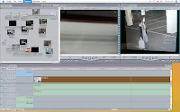
This image demonstrates our project during the editing process.
These are clips that we thought about using but we decided not to. This also features clips that didn't go so well such as the scene where one of the actors kept laughing when she was being choked so we used a different actor while we were filming.

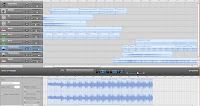
These are some of the music that we made on garageband while composing the music for our opening sequence.

This is our new logo as we had to change the background as the white background did not go well the clip. We also had to change the angel as we had to put the white lining as it was blending with the background which we didn't want.